
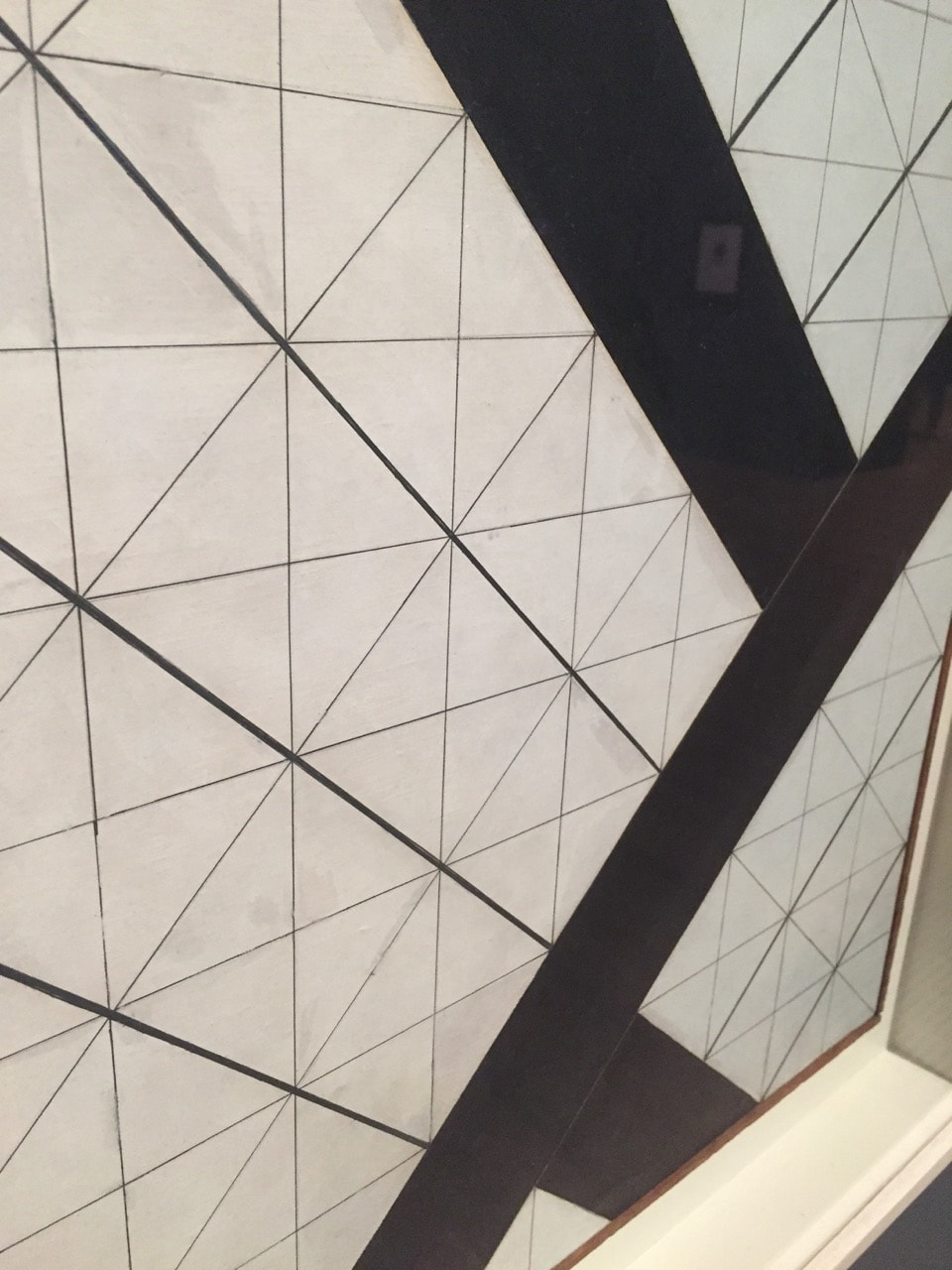
Abstraction
Personally I think that every single photo that somebody takes can be abstract, this is because even though you are taking a picture of the real world you are freezing that moment in time forever. However I only think that it is abstract if you can explain a way how it can be abstract in any way you want.
Summer photoshoot


Formal elements
Formal elements are the things used to make a piece of art work. Things that make a photograph are: focus, light, line, repetition, shape, space, texture and tone.
|
Focus:
Light: Line: Repetition: Shape: Space: Texture: Value/Tone: |
Which areas appear clearest or sharpest in the photograph? Which do not?
Which areas of the photograph are brightest? Are there any shadows? Does the photograph allow you to guess the time of day? Is the light natural or artificial? Harsh or soft? Reflected or direct? Are there objects in the photograph that act as lines? Are they straight, curvy, thin, thick? Do the lines create direction in the photograph? Do they outline? Do the lines show movement or energy? Are there any objects, shapes or lines which repeat and create a pattern? Do you see geometric (straight edged) or organic (curvy) shapes? Which are they? Is there depth to the photograph or does it seem shallow? What creates this appearance? Are there important negative (empty) spaces in addition to positive (solid) spaces? Is there depth created by spatial illusions i.e. perspective? If you could touch the surface of the photograph how would it feel? How do the objects in the picture look like they would feel? Is there a range of tones from dark to light? Where is the darkest value? Where is the lightest? |
School abstractions
These photographs that I have taken is my fist attempt at taken abstract photos, after having a discussion about the meaning of the word as a class.


WWW: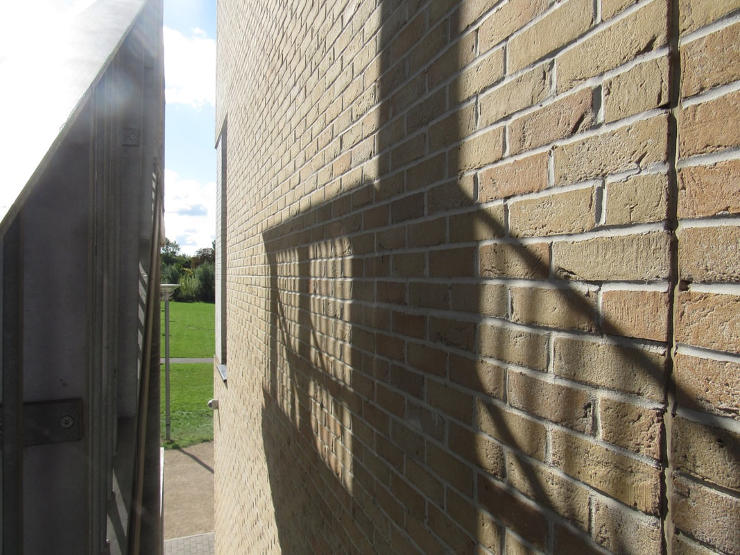
I think that this photo represent some on the formal element very well. This is because it has some line in it also it uses light to create the shadow on the other side on the wall. Finally it also has some repetition in the shadow on the wall to make a pattern.
|
EBI: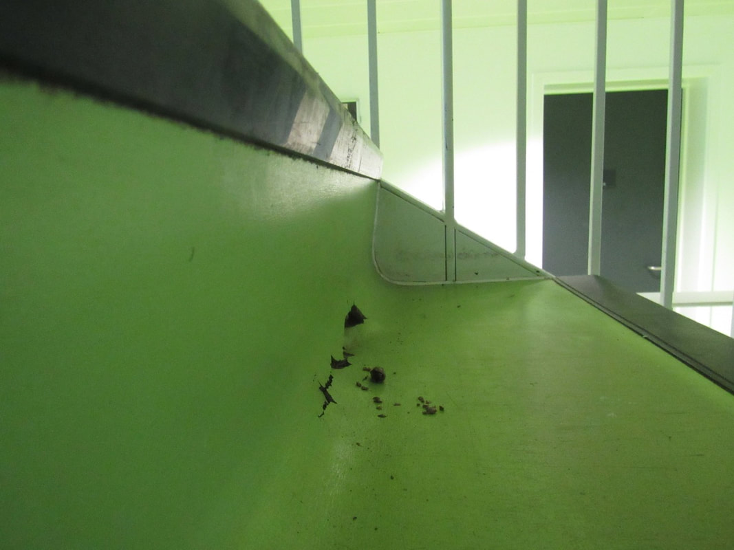
This photo does not really show any of the formal elements that clearly which means that it has not really followed the task which was set. The only one that you might say it has in it is lines and even that has been used in a very boring way.
|
'Abstraction, Twin Lakes, Connecticut'
The task was to really look at the photo in detail and then attempt to draw it as best as you could. Then I had to answer the questions below in my own words. The fact that I drew it really helped me understand the photo in much more detail because then i can really understand all of the edges and shadows in the photo.
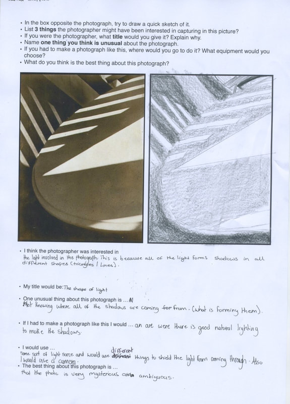
Photo shoot of ONE formal element
The task was to take a set of photographs that only focus on one formal element. I know that there are going to be other formal elements in the photograph but there should be one that is the main focus. I decided to focus on lines because there are many different things that you could see lines in.


WWW: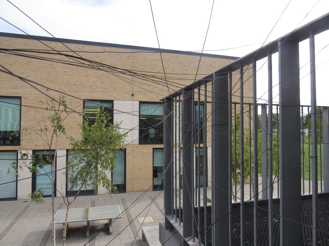
The task which was set was that I had to use one formal element and I chose lines. I feel that this photo best represents this because there are many different lines nut in many different ways not just in one object.
|
EBI: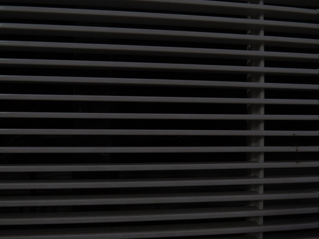
I feel that this photo is the one which followed the rules but did not really come out that well. This is because it is not really straight and the photo is just a bit to dark.
|
Photogram


WWW: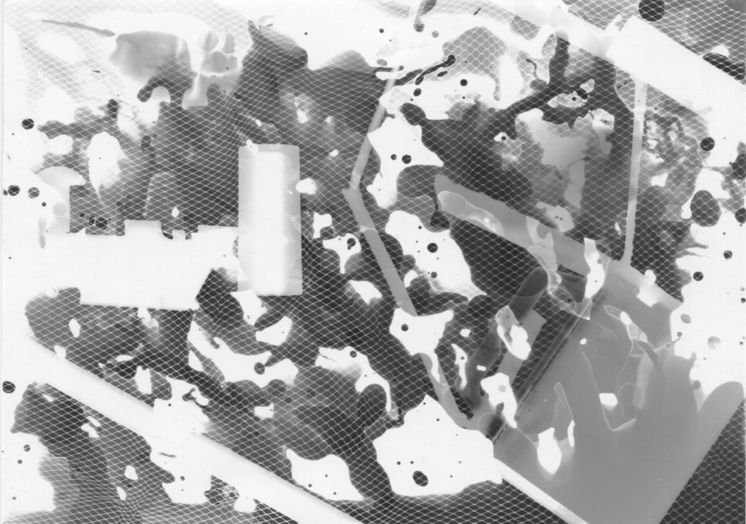
I feel that this was the best photogram that I made. This is because you really cant see what it is and that is the whole point of making a photo abstract.
|
EBI: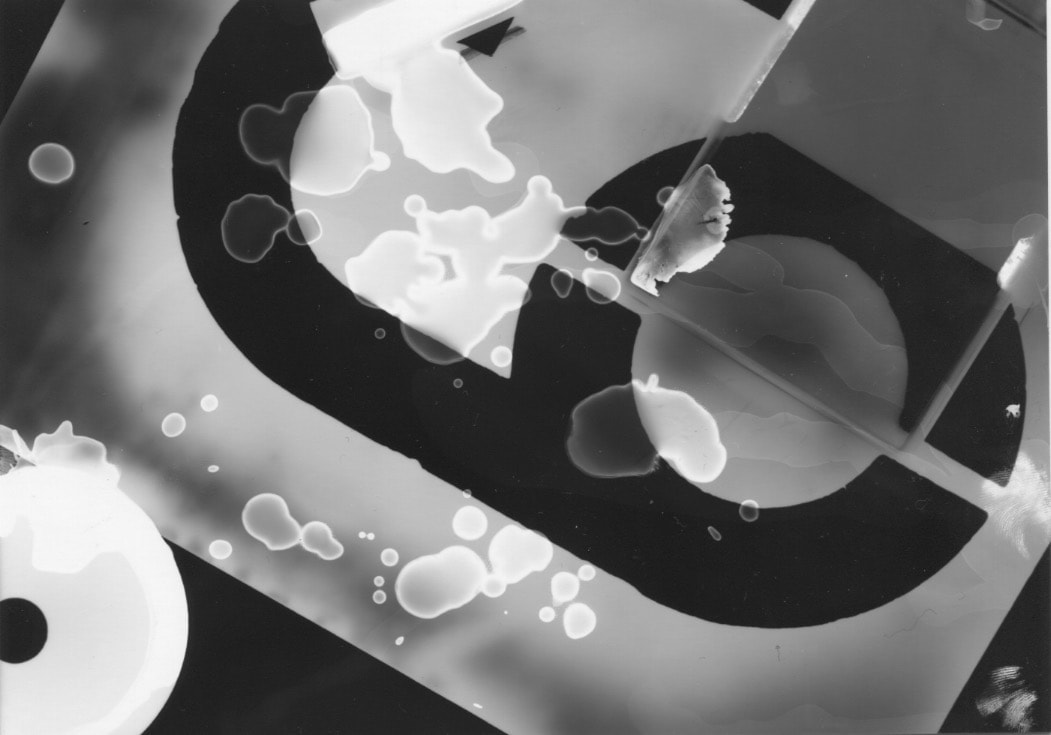
This is the least abstract photo that I have made. This is because you can clearly identify at least one object in this photograph and that is a number six stencil.
|
Photogram cut up
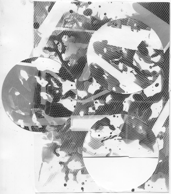
This task as to cut up a photogram that you have already made and make it even more abstract than it already was. So I chose my favourite photogram and scanned it then I printed it out on normal paper and experimented with cutting it up into all different things and the photo above was my end result.
What is a photogram?
A photogram is a photographic print made by laying objects onto photographic paper and exposing it to light. It is photo which is not taken with a camera.
Developer: The developer reacts with the areas of the silver in the paper's emulsion and will turn these parts black. The more it has been exposed to light the more black it will become. The areas which have been covered by the objects which you place will not become black because they have not been exposed to light.
Stop Bath: This chemical will stop the developer from processing which will stop it form getting over develop.
Fixer: This dissolves any unused parts which were not developed, this stops the paper from becoming over developed.
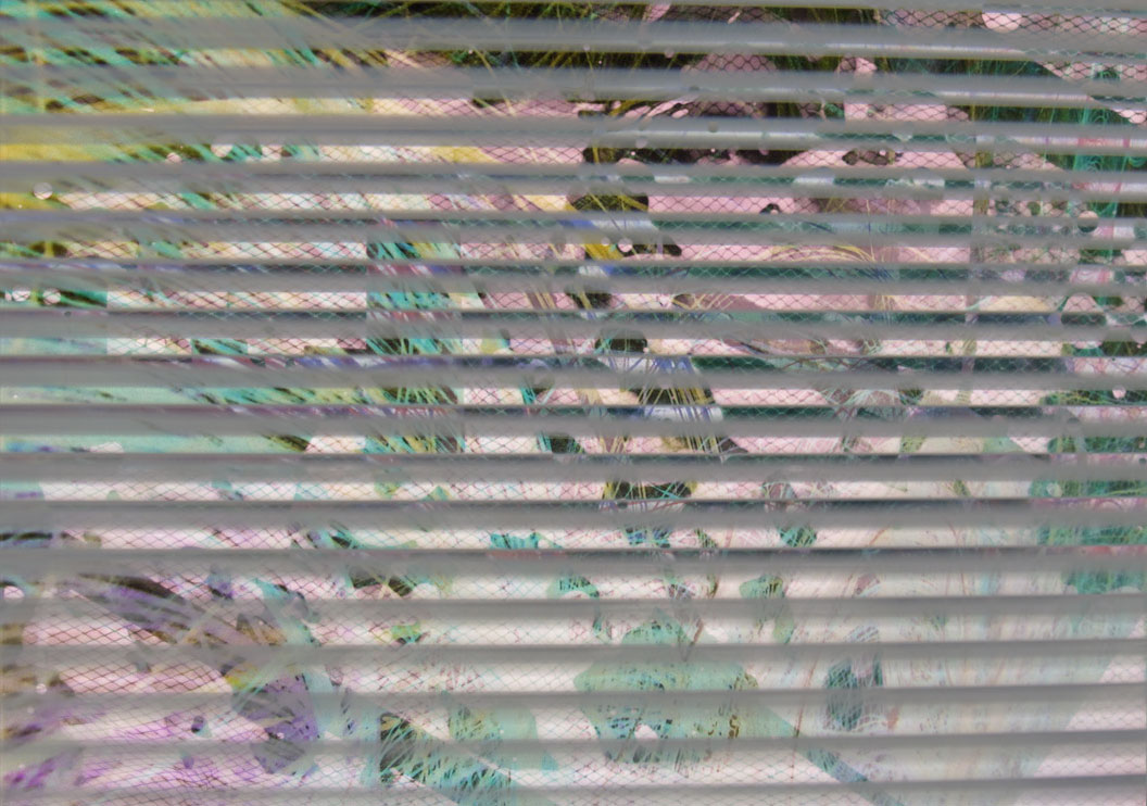
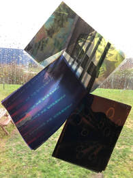
Photogram Photoshop
|
|
In photo shop I got one of my photograms and made it into a normal duotone, then I got another one of my abstract photos and put it on top then I blended the two photos together to get one. The one on the left only has one photo on top but the one on the right actually has two layers of photographs.
Final photogram board
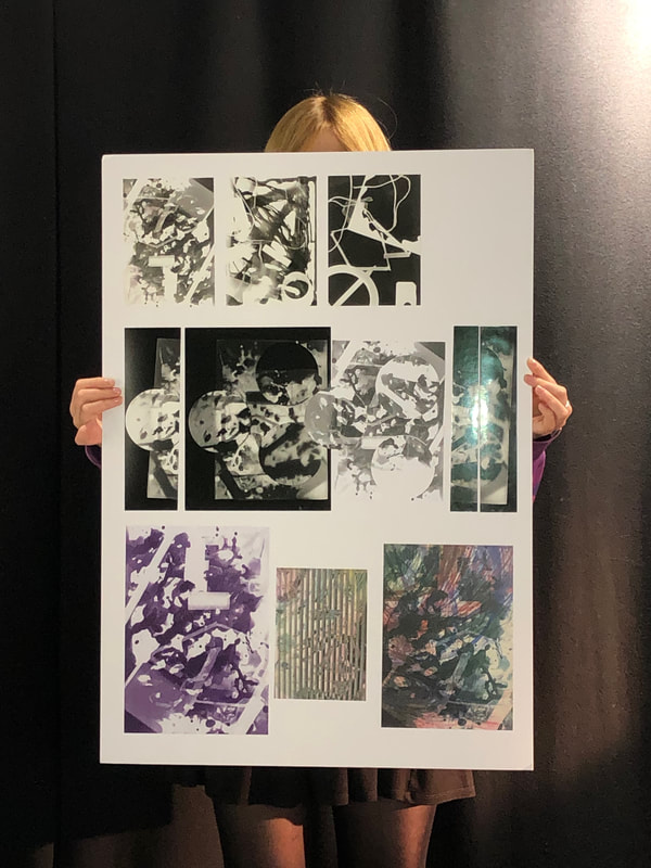
Evaluation
I decided to display my work onto a black board. This is because it gives me the ability to be able to:
- change the shape of the board
- change the colour of the board
- display the photographs in the way I want to
I have chosen to display my photos in chronological order of the way I made them. Starting with the basic photograms and then moving onto cutting and rearranging the way my photo is and then finally using Photoshop to to obscure my photos.
Abstract photographs shoot


Evaluation
|
|
WWW: |
EBI: |
|
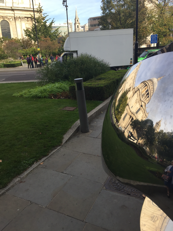
I feel that this the best photo that I took in the half term project. This is because when people look at it they find it very hard to know what it is and sometimes they can never work out what it actually it. Also I like the way the shadows are around the centre object in the middle.
|
This photo actually is not really following the idea of what the photos are meant to be like. This is because you know what it is as soon as you look at it and that is really not the point. Maybe if I just took a picture of the metal ball closer up the photo would have turned out more abstract.
|
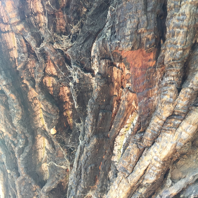
Aaron Siskind
Siskind turned the medium of photography on its head, taking pictures of found objects that were simultaneously true-to-life and abstract. He was one of the first photographers To combined what is known as straight photography with abstraction.


The things that I like that Siskind does is:
The fact that his subject is very close up and you can really see the detail in all of his photographs. This interests me because maybe the actual object is not actually abstract but because of how close he has taken the photo it has made it so you don't actually know what the thing is in the photo. Also The fact that these two pictures are in black and white makes the photo even more hard to understand. This is because if it was in colour it would be more realistic and easier to understand. Also I love the fact the he plays with different textures and surfaces form the natural world but also from natural surfaces. These tow things are very different but in his photos he makes them look quite similar to what they actually are in real life and this is because of the at he places his camera.
The fact that his subject is very close up and you can really see the detail in all of his photographs. This interests me because maybe the actual object is not actually abstract but because of how close he has taken the photo it has made it so you don't actually know what the thing is in the photo. Also The fact that these two pictures are in black and white makes the photo even more hard to understand. This is because if it was in colour it would be more realistic and easier to understand. Also I love the fact the he plays with different textures and surfaces form the natural world but also from natural surfaces. These tow things are very different but in his photos he makes them look quite similar to what they actually are in real life and this is because of the at he places his camera.
- What do his photographs have in common? All of the photographs are of natural and urban surfaces e.g tree trunks and city walls. Also these set of photographs that he has taken are in black and white.
- What materials did he use to print his photographs? "The Siskind Archive includes 900 fine prints, all of his negatives, and many contact prints. " https://ccp.arizona.edu/artists/aaron-siskind
- What camera did he use? He used a large format camera.
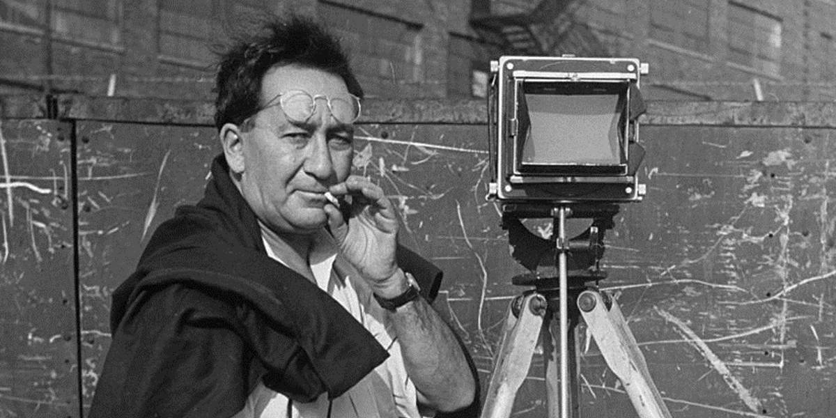
- What inspired inspired him to take these set of pictures? "Siskind’s photographic interests moved away from socially centered, literal documentary works toward the more formal, poetic, conceptual images for which he became internationally renowned. This shift from document to metaphor embodied images of weathered fragments and textured surfaces through which he explored ideas of decay, fragmentation, and regeneration." https://ccp.arizona.edu/artists/aaron-siskind
How to take a photograph like Aaron Siskind:
- Make sure the photo is in black and white.
- Find a decayed surface or natural surface e.g tree trunk.
- Get close up to the subject.
- Make sure the picture plain is parallel to the subject.
- Take your photo.
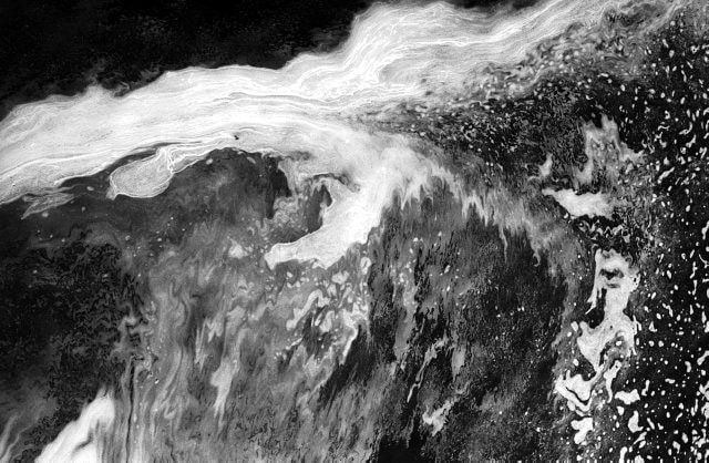
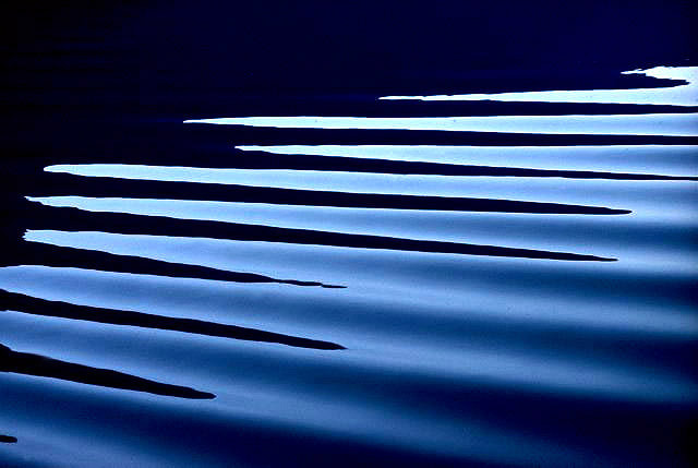
Ernst Haas
Haas is famous for his images of movement using long shutter speeds. He has photographed water throughout his career because he likes the idea of the ability to reflect light. He crops the subject to make it more abstract.
|
|
Things that I like that Haas does:
The fact that the photo that he actually takes may not be abstract he makes it by cropping the subject of the photograph. Also I like the fact that he uses colour and no colour photos to make them different, however they are all similar in some way. Also the fact that he is using water in his photos and not making I look completely different because you can still sort of see that the subject it is water.
The fact that the photo that he actually takes may not be abstract he makes it by cropping the subject of the photograph. Also I like the fact that he uses colour and no colour photos to make them different, however they are all similar in some way. Also the fact that he is using water in his photos and not making I look completely different because you can still sort of see that the subject it is water.
Photobook


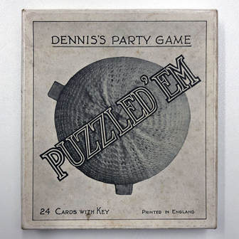
'Puzzled 'Em'
The challenge:
I need to create my own version the game 'Puzzle'em' with my own photographs. We have decide:
1. How many cards to make
2. What objects to use
3. What backdrop will I use
The idea of this is to take the photo of the objects in a way that will confuse the person looking at them so they find it hard to look at and hard to know what it is.
|
The inspiration for this challenge is from the old party game called 'Puzzle'Em' that we got shown at the start if this project. 'Puzzle 'Em' is a game which has 24 photo cards and the aim of the game is to guess what they are. The reason it is had is because the photos have been taken form strange and unusual angles.
|


Other versions of the game


There are actually many different versions of this game with al different photographs. This game is obviously very popular and a great way to puzzle and exercise your mind. I feel that the most interesting game out of all of them is Puzzled ' em this is because all of the photos have been cropped out of there surrounding and are all in black and white and finally they are on a square piece of card which makes it so you you do not really know what way you should be holding the card and it makes your imagination stretch and become more developed.
Salvador Dali and Brassai
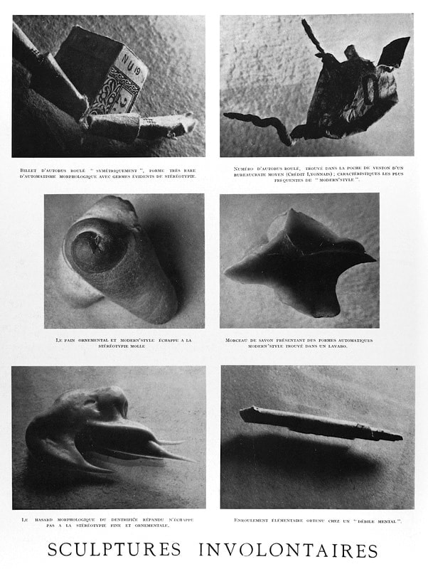
These set of photographs include things such as smeared tooth paste on glass and a rolled up bus ticket. Brassai has deliberately confused the viewers by photographing the objects out of context and very close up.
My thoughts on the photographs:
-The photographs trick your brain into thinking they are something else when in reality they are just something that you would use and see in your every day life. He has done this by having the camera very close to the subject also by having the objects out of contexts makes it harder for the viewer to know what it is. For example the toothpaste is not in the tooth paste tube which makes it much harder to guess what it is.
My ideas
- Have all of the photos square. This is because a square has all equal sides so you can turn the player does not really know which way round the right one is.
- Have all of the photos out of context [e.g a spoon out of the draw]. This is because if something it out of its regular space then it will be harder to identify what the object is.
- Have all of the photos black and white. If the photos are not in there original colour it will confuse the player into thinking that it is something else.
- Have all of the photos close up. This will crop out some of the object so that you can not see the full thing which will make it harder to understand what it is.
My first attempt


My second attempt


With my second attempt of photographs i adventured with lots more different angles also i took some photos form a birds eye view and this is because in ever day life you are never really looking at thing from a birds eye point of view.
My game

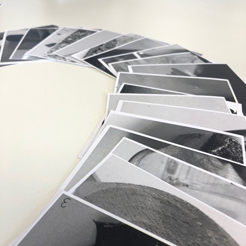


The inspiration for my game came from the game puzzled'em. I made all of my photographs square and made them all black and white. I made 20 photographs in total and made a key and instructions to go along with the game.
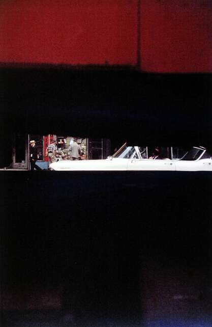
Saul Leiter


Out of all of the photographs that i chose this was the one which interested me the most. This is because even though the subject of the photo, which I think is the middle part, is the smallest part of the whole photograph.
Studying Saul Leiter
5 characteristics that define Leiter's photographs are:
- The use of a shallow depth of focus
- The use of bold colours contrasting with the lighter colours
- Surprising composition
- The use of one main colour
- Capturing moving objects
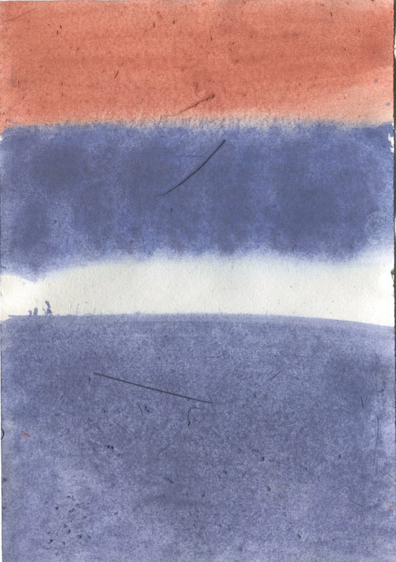
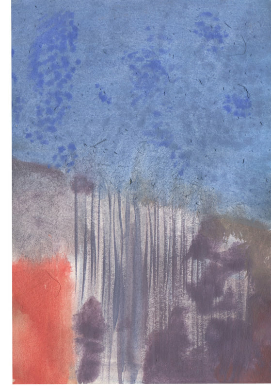
Painting Saul Lieter's photographs
|
|
|
|
I was told to look at the saul leiter photographs and try and recreate the images in the way we see them. Also we could only use the three primary colours (red, yellow, blue). This is why the paintings to not look exactly the same as the images. I learnt that when recreating his photographs even though they may look confusing you can create a simple version and it will still look like the original photograph.
Saul Leiter Geometry
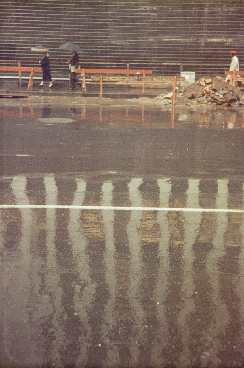
|
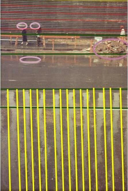
|
Through doing this activity I have learnt that this photo uses the repetition of vertical lines. Also it uses the repetition of the oval shaper in the background of the photograph.
Half term project


These photographs are my take on the photographer Saul Leiter. I took a photograph looking through a window because this is something that saul leiter likes to explore.
View finder


In these set of photos I focused on the formal element of focus. For example I took two versions of the same photo where one of them was focusing on the subject through the view finder and the other was focusing on the view finder.
Formal elements project
The formal element that i would like to focus on is the idea of focus. I am using this because i feel that you can use this idea in many different ways and explore the idea in your own way and get a lot of insperration from other photographers such as Uta Barth.
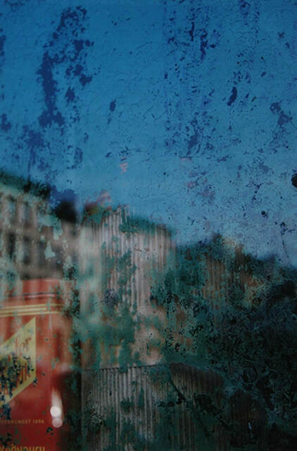
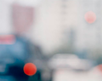
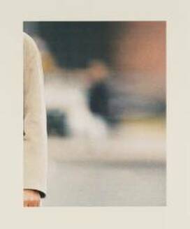
Uta Barth
Uta Barth (born 1958) is a contemporary photographer who lives and works in Los Angeles, California.
|
|
I chose these two photographs because I like that they are on the street and are taking everyday things that we see and making them into something that you get confused and have to think about the photograph. Also I like the fact that even though they are out of focus you can still work out what the objects are in the image. In the photo to the right i lie that there is some parts in focus and other parts out of focus because then your eyes are fist drawn to the arm which is in focus and then you eyes drift to the background because you get curious to what is actually in the background.
Formal element Final piece
For my formal element project i want to produce a 3D cube and then put my images onto each side of the cube. I am not sure if i only want to use one fromal element or if i should incorporate many of the formal elements together.


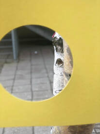
Abstraction piece
Franz West
I had a lot of inspiration fro the artist Franz west.
"Franz West (1947–2012) brought a punk aesthetic into the pristine spaces of art galleries. His abstract sculptures, furniture, collages and large-scale works are direct, crude and unpretentious." Tate modern
"Franz West (1947–2012) brought a punk aesthetic into the pristine spaces of art galleries. His abstract sculptures, furniture, collages and large-scale works are direct, crude and unpretentious." Tate modern
Abstraction Evaluation
For the final project I researched Franz West, this is because I feel like the colours that he uses in his work are very bright and intriguing to look at. To get a better insight of his work i went to the tate modern to view his exhibition, I thought that his work really uses a lot of abstract elements. One of the main things that stood out to me were his sculptures this was because when you photograph them from different angle they almost look like a whole different sculpture. I learnt form this the many different angles that you can photograph the sane thing to make it look like a whole new object. At the start of this project i wrote a sentence about abstraction "Personally I think that every single photo that somebody takes can be abstract, this is because even though you are taking a picture of the real world you are freezing that moment in time forever. However I only think that it is abstract if you can explain a way how it can be abstract in any way you want." However as the project has gone on i have realised that a lot of artists really focus on one of the formal elements, which then makes the photographs much more abstract. For example I researched the work of Ult Barth and she really focuses on the formal element of focus, she takes photographs of what I see as everyday things and turns them into something much more interesting and a photo which you could really discuss in detail and give many point about it. I think one of my best ideas for abstraction was using the formal element focus and also then using photo shop and making the people looking at the photo find it more difficult to see what is actually in the photo.
I have tried many thing during the abstraction course. Some of the things that I have tried are :
- Photoshop
- Photograms
- Obstructing the view of the camera
- Using all of the formal elements together and some by them selves
I feel that the idea that I enjoyed doing the most was using the formal elements in my work this was because it made the photos actually mean something and people looking at it can notice which formal elements that I have used if they have been done properly so it helps you see if the work you are doing is actually right. I feel that you take many creative risks through out any art and some you realise but then others you just do by mistake and realise what you have done. I feel like something i did that was a risk is when I made my abstraction book i printed all of my photographs onto acetate, this was a risk because one acetate is expensive, also the photos may have not showed up the way that I would have liked. However I feel as if they came out very well and really put across the idea of abstraction.
Throughout the course i have really refined the way I use the formal elements, because I did look at them at the start of the course however I feel that I have really developed the way I use the formal elements. An example of this was when I used a piece of card and put it in front of the camera to use it as another focusing point.
The final outcomes that I have produced are:
- Photogram board
- Abstract book
- Puzzled'em game
- Formal elements box
- Abstract board
The final outcome which I am most happy with is the game that i made. This is because I really thing it portrays the idea of Abstraction really well this is because all of the cards that I made for the game are really hard to distinguish what they are, therefor are very different from the real world and what you see in your day to day life. If I had more time to do all of these final outcomes also if a had a very big budget I would:
. Photogram board: I would make this on a much larger scale and make much larger versions of my photographs also would have made more than one of the broads so that I could improve on them each time I do one.
- Abstract book: I would have wanted to try and transfer my photographs onto a lot of glass slabs.
- Puzzeld'em game: I would have wanted to make a box for my game to make this more realistic.
- Formal elements box: For this I would have wanted to make a much bigger box which I would have had to buy and then put my photographs on the box.
- Abstract board: Just like the photogram board i would have made it on a much larger scale.
